Always Open
DESIGN
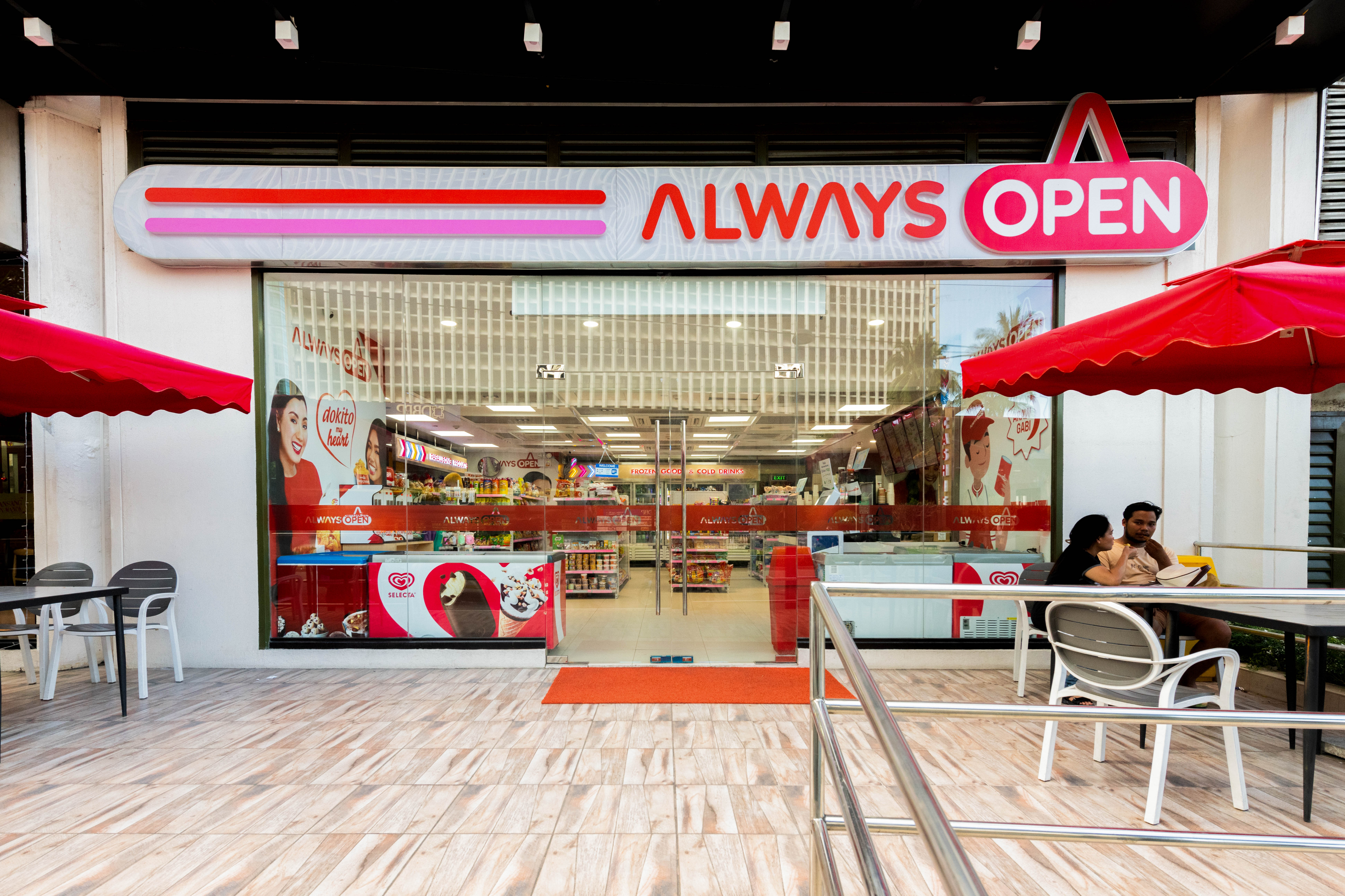
Always Open is a Filipino-owned retail concept that aims to stand out among the slew of convenience stores in Manila’s central business districts while uniquely communicating its “Always Open” proposition. PINO Studio collaborated with the brand by designing a visual identity that stands out from rush hour to after hours.
.jpg)

The Challenge
In the Philippines, convenience stores are everywhere. Big, foreign brand names have become valuable over time. But because Always Open was new, it needed to be different. More than just another store, it had to be a space that felt human, inviting, and familiar.
.jpg)
.jpg)
Our Solution
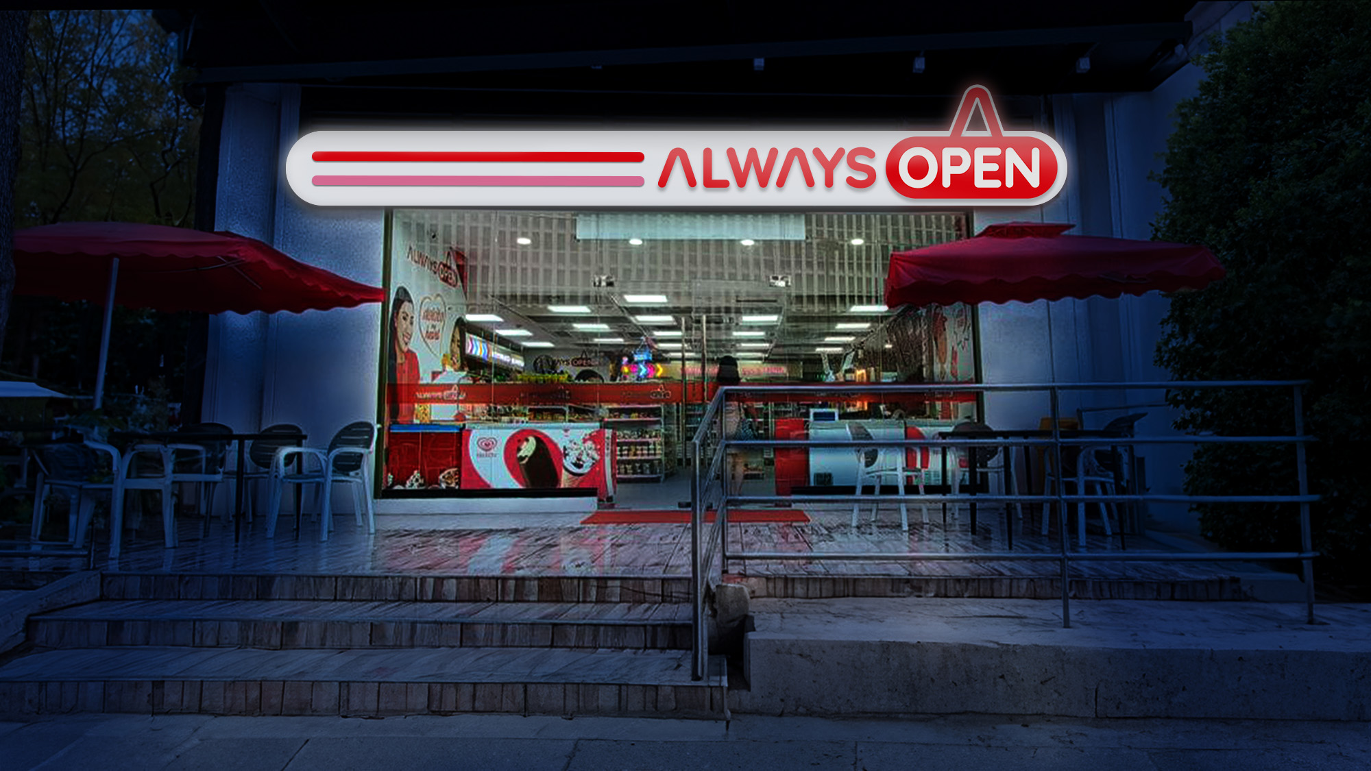
The logo of the new Philippine convenience store Always Open utilizes a universal symbol for accessibility – an "open" sign that never changes. Coupled with rounded edges, welcoming typography, and the clever use of the hanging string to stand for the letter “A,” the logo inspires a welcoming and vibrant atmosphere.
Simple and direct, it efficiently communicates that the store welcomes customers 24/7. Day or night, it is a silhouette that everyone recognizes, a break from the rigid rectangular signs in the city.
.jpg)
The Identity
The logo uses Michelangelo’s Golden Ratio circles to create a balanced and visually-appealing mark that breaks from rigid designs. The iconic open sign is versatile, expanding the visual language of Araw-Gabi convenience from merchandising to creative messaging. As a visual cue, it guides behavior, compelling customers to enter any time.

.jpg)
.jpg)
Our work for Always Open reimagines what it means to be a convenience store in the Philippines. By combining a universally recognizable symbol with thoughtful design principles, the brand stands out amid familiar competition — not through noise, but through warmth and clarity. The result is a brand that feels accessible, human, and ever-present, just like its name promises: always open and always welcoming.
Visit an Always Open store at select locations across Metro Manila.


