The Identity
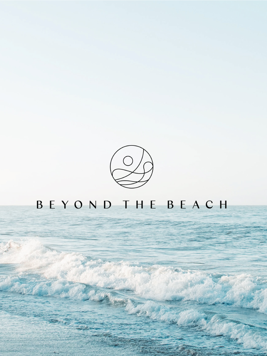
The Beyond The Beach brand logo is a valuable asset that should be used appropriately across all platforms and in all correspondence. It serves as the central brand element and communicator.
The simple and elegant logo breathes the beauty of the ocean into the brand’s products. Our team created an abstract execution of the logo similar to the movement of the ocean waves, portraying the brand as a summer companion.


Typography and Colors
Inspired by the waves of the ocean, the typography system of the brand is fluid and flexible. The brand features a Columbia Sans type that features a transition between thick and thin lines. The brand colors capture the beach through hues. The blue represents the sea, and the touches of yellow symbolize the sand.


Application
The simplicity of the brand identity our team designed for Beyond the Beach allows it to be versatile. With a wave-like pattern, the abstract imagery of the logo is perfect for various prints. Sprouting from the brand logo itself, colors and graphic elements are incorporated into an array of applications. The wave motion can also be fused into typography for the brand, creating a modular look for different collaterals.