eTap Inc.
DEsign
web
eTap Inc. (Electronic Transfer & Advance Processing Inc.), founded in 2017, is the country’s leading developer, manufacturer, and operator of customizable self-service technology & payments systems. We worked with eTap Inc. to craft their visual identity and website design — ensuring a seamless and elevated digital experience for their clients and stakeholders.

The Challenge
eTap Inc.’s existing brand carried a proudly Filipino identity, but it struggled to position the company competitively within a broader market. As eTap Inc. prepared for international expansion, there was a clear need to evolve its branding toward a more global, professional image that still retained its local roots.
The rebrand aimed to establish eTap as professional, innovative, and reliable, setting it apart from its B2C subsidiary, eTap Solutions. Beyond visual appeal, the company sought a modern, user-friendly interface that clearly communicated its role as a leading provider of self-service technology solutions.

Our Solution
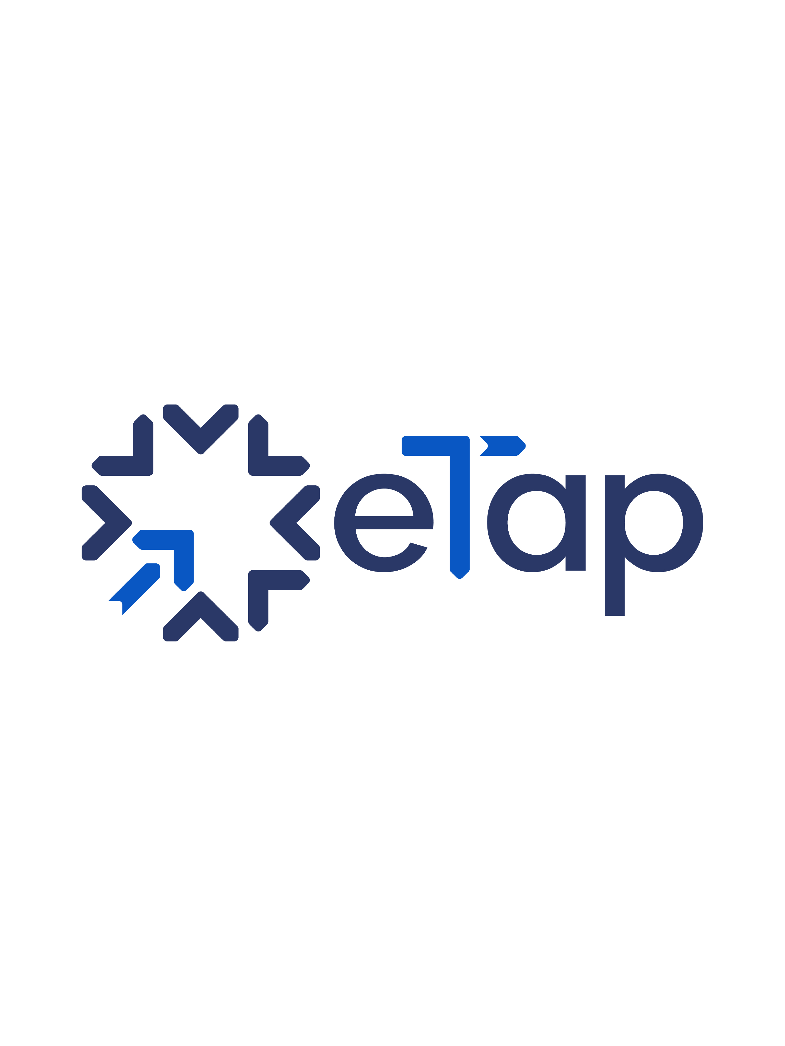
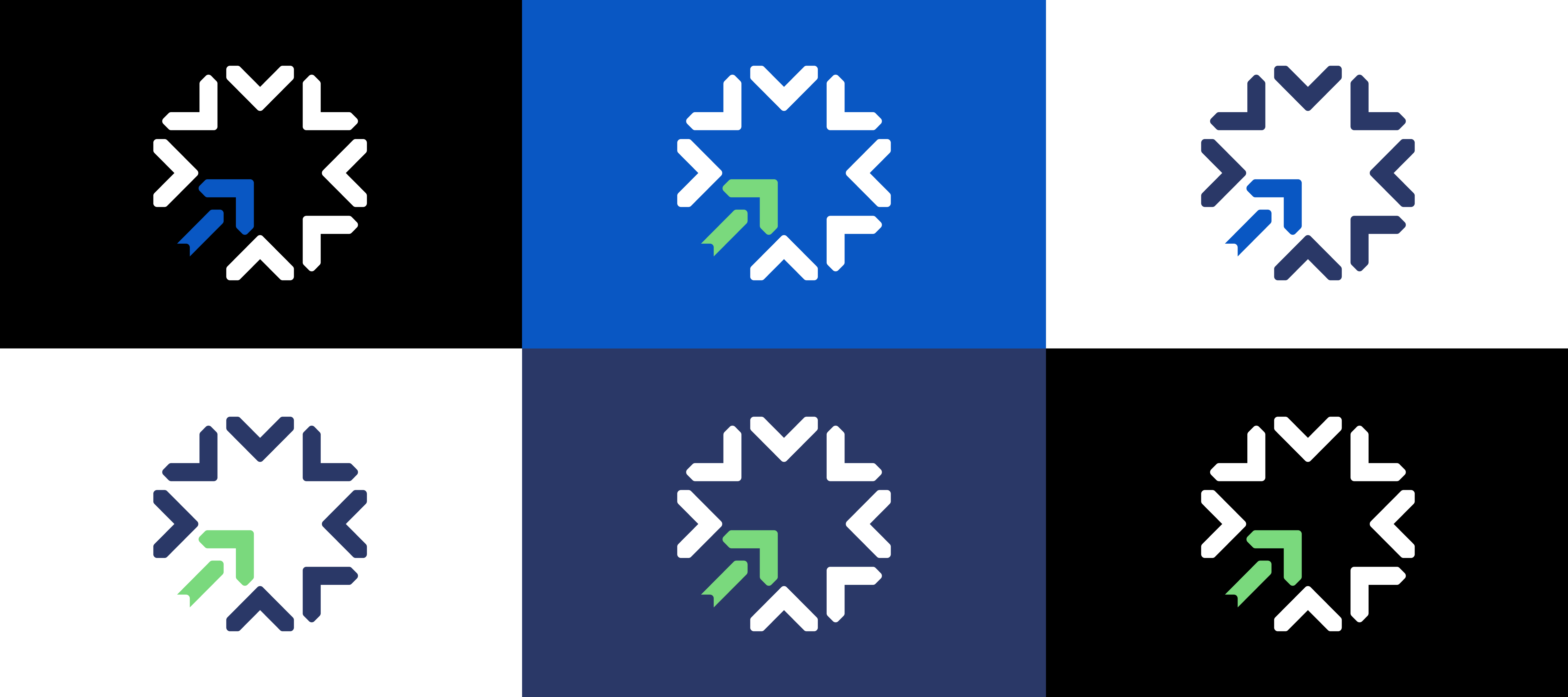
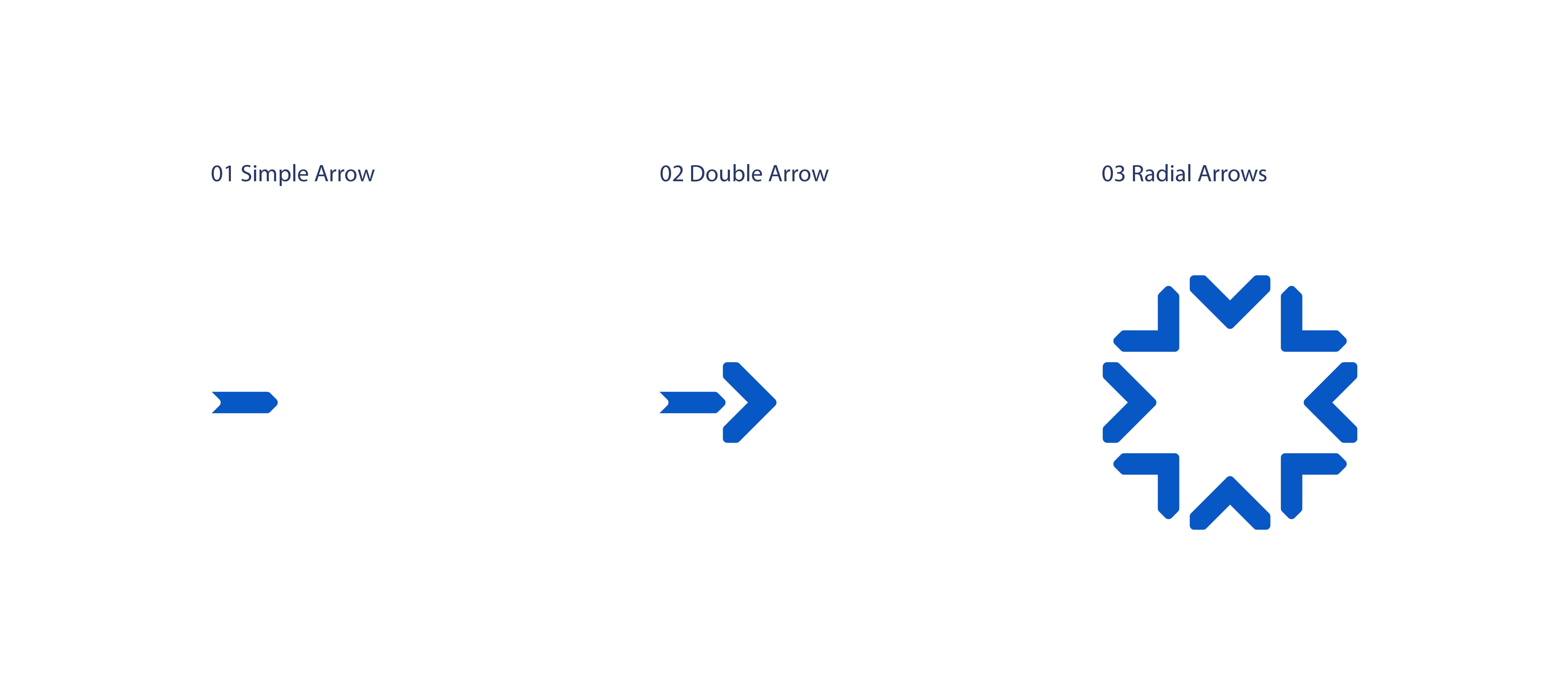
Drawing inspiration from the brand’s name, eTap’s new identity centers around a dynamic symbol composed of arrows converging toward a single point — a visual representation of the “tap” motion. The upward-pointing arrow is emphasized to signify progress, innovation, and the brand’s forward-thinking vision.
The design reflects eTap’s commitment to empowering businesses through technology — positioning it as a future-ready company that delivers customized and scalable self-service solutions.
Verbal Identity
PINO also strengthened the brand’s verbal identity by highlighting key values of reliability, accessibility, and security — emphasizing eTap’s distinction as the only local manufacturer of self-service technology with a robust back-end system and in-house development capabilities. These refinements were crafted to not only reinforce trust and credibility but also to position eTap confidently on the global stage.
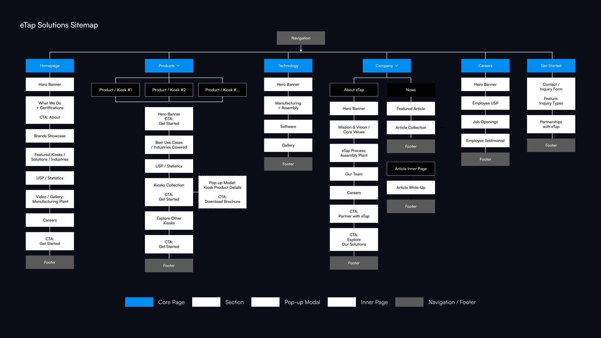
Branding the Website
Following eTap Inc.’s rebranding with PINO’s brand team, the key challenge was ensuring that the website aligned seamlessly with the new brand direction. The design approach focused on creating a cohesive digital experience that visually reinforced the refreshed identity.
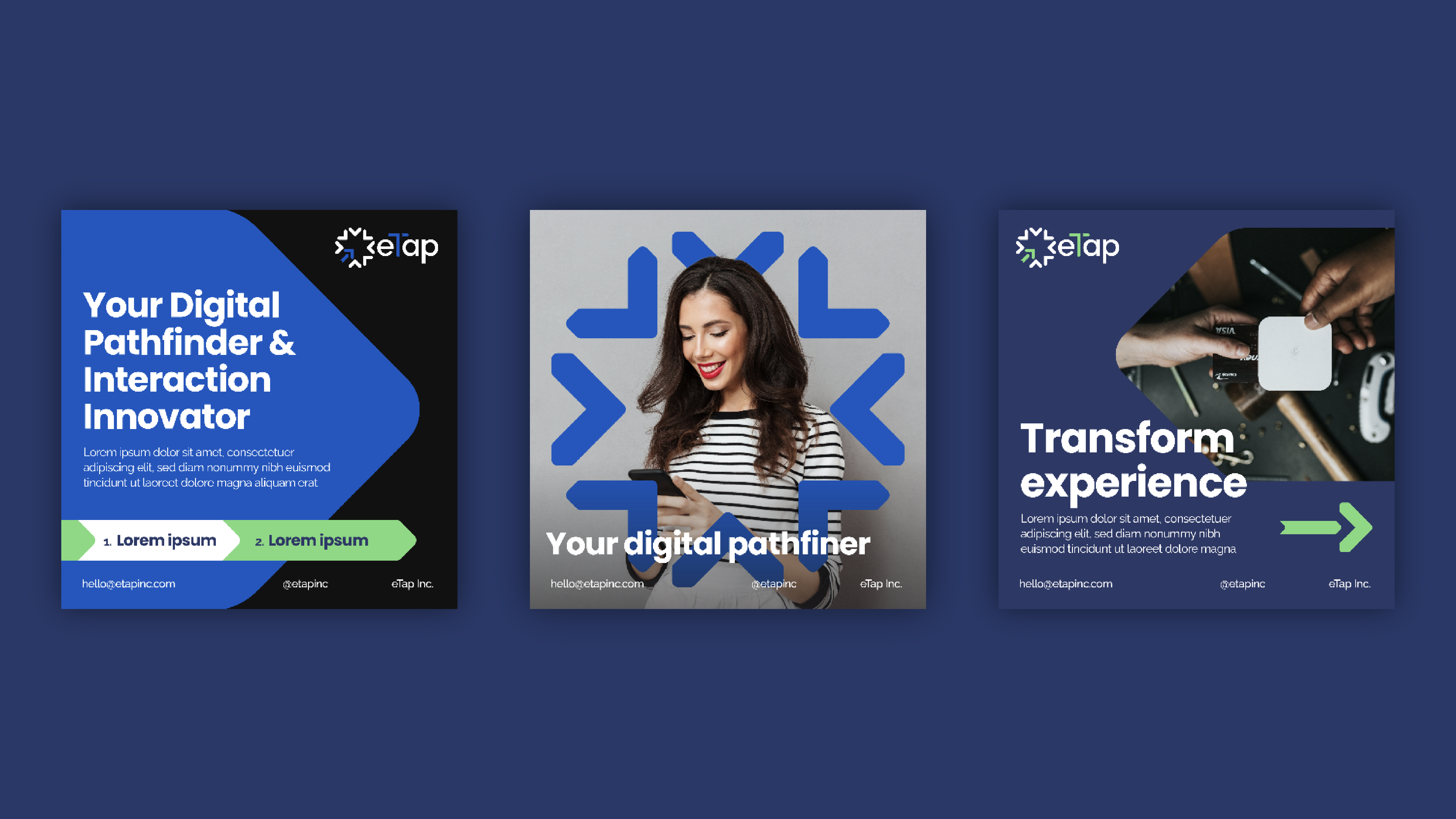
Core visual elements were drawn from the logo mark, which was strategically integrated throughout the site — framing text, guiding layouts, and adding visual consistency across pages.


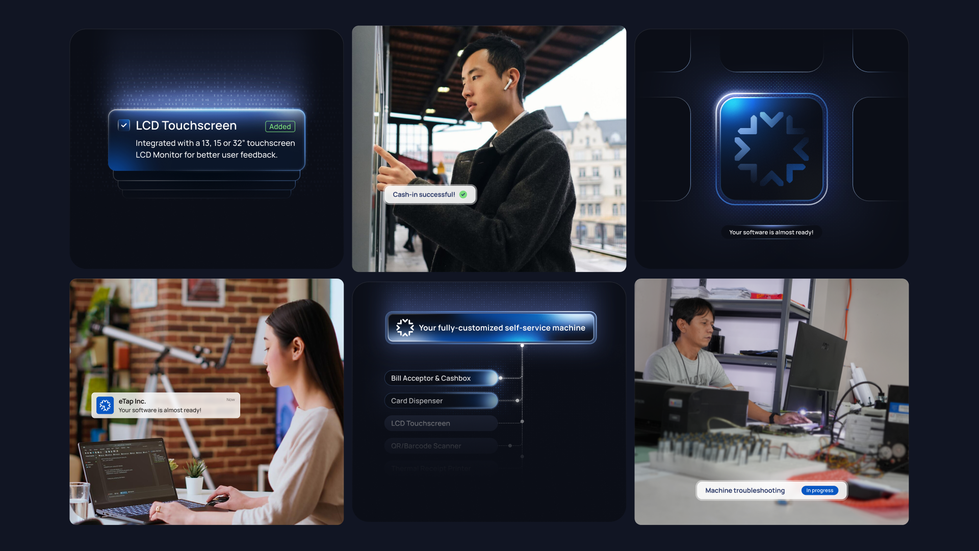
Tech Illustrations
Custom illustrations were developed to highlight eTap Inc.’s range of products and kiosks. The visual style embraced a tech-forward and futuristic aesthetic, reflecting the brand’s commitment to innovation and its role in shaping the future of self-service technology.


Through a cohesive rebrand and digital transformation, PINO helped eTap Inc. redefine its identity as a professional, innovative, and globally competitive technology provider. From logo to language to website, the new identity reflects a forward-thinking company rooted in reliability and Filipino ingenuity.
The result is a unified brand and digital presence that positions eTap as a trusted leader in self-service technology, ready to expand its impact on both local and global stages.


